Why Focused User Experience Design is the ONLY Way Forward

Your Guide to Understanding User First Website Design
Every single day you’re surrounded by different types of user experiences. Once you open your eyes to this fact then you’ll start seeing the world in a whole new way and the concepts surrounding user experience design will fall seamlessly into place.
“User Experience” (UX) is defined as the user journey or experience of a person using a product, service or system. Everything you interact with on a daily basis in order to accomplish something has a UX that comes along with it, whether it’s making a pot of fresh coffee in the morning, or trying to place an order on Amazon.
This concept that has been around since humans decided to invent things like a round wheel, to make the experience of traveling and moving large objects manageable.
How User Experiences Have Changed
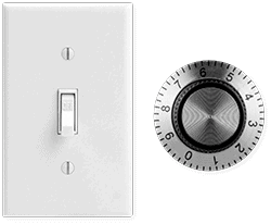
However, because technology has advanced so fast, the limitations of what user experiences are possible have been vaporized. This is both a blessing and a curse, because naturally as humans when left to our own devices we’re great at covering the complete spectrum from astonishingly amazing to absolutely awful.
Let’s look closely at different user experience designs you might deal with in a typical day. Your current ‘alarm clock’ probably isn’t just a clock with a switch and a timer. The typical alarm clock not only wakes you up in the morning, it can track your sleeping habits, provide a soundtrack for you to sleep to, and have special lighting effects that changed throughout the night – all designed to help you sleep better and wake up refreshed… er, and the original goal of the whole thing… wake up on time.
Now let’s take it even further… your vehicle. If you’ve purchased a vehicle recently, even though every piece of technology built-in is supposed to make your driving experience easier, you know how intimidating sitting in the seat and starting the engine for the first time can be. Physical knobs and switches have been replaced by digital dashboards, multiple touch screens and a myriad of other shiny things that can be overwhelming at first. The experience of driving has taken on a whole new meaning… most of which isn’t (and in a few years none of it will be) actually about driving.
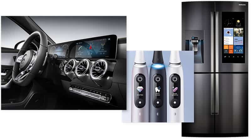
Common User Experiences we don’t often think of but use every day.
On a daily basis, it’s a lot to take in. The more advanced we get, the more we struggle with those advancements, as designers are so addicted to pushing it to the limit that nothing seems simple anymore.
With all the above in mind, can you recognize all the various user experiences around you now – the good, the bad, and the ugly? Excellent, because now that you understand what we’re dealing with, you can turn your attention directly to your business and apply this awareness there.
What UX? – Why User Experience Is So Important Now
User Experience is the fundamental live or die element for your brand. It’s your UX that compels your user base and customers to want to use your product or buy into your brand over another. It’s there with them at every single point of engagement, both online and offline. Your brand experience has the potential to create more authority and trust in your brand than any flashy advertising or marketing campaign ever could, whereas a bad user experience can destroy your brand in seconds.
Characteristics of a Great Website User Experience…
- Invisibly allows a Brand’s Promise, Truth and Story to shine.
- Allows the person landing on your site to be able to effortlessly find what they are looking for, engage with it, and as a result be compelled to do the thing you want them to do.
- Only includes things that have a good reason for being there.
- Pays attention to the smallest of details.
So, you want to build the best possible user experience for potential customers coming to your website. Before you start building, let’s take a look at the two big challenges you, and anyone else doing anything online, face.
 Challenge #1: Existing In An Infinitely Small Space
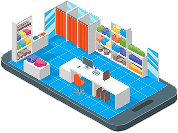
Yes, you read that right, infinitely small. Your website exists in a digital world where the space is actually infinite in size and contains infinite things. However, it’s also a space that is constrained to a small, flat mobile device that’s designed to fit in your pocket.
So, the real question is – how do you get customers to enter into this space and feel compelled to take the action you ultimately want them to take? It’s easy to imagine achieving this goal in a physical store space, but how do you achieve it online when you have to shrink and flatten everything down into this small, yet infinite space?
This is where a great user experience shines. It overcomes these constraints and allows your clients to intuitively engage with your brand in a manner that feels easy, friendly, trustworthy and simple.
Challenge #2: Making Complexity Appear Simple
This statement was carried through the design of all of the Apple products under his watch. This philosophy grew out of the early days of computer operating systems all the way through to the now predictable, extremely intuitive gesture-based interactions many devices incorporate today. Users intuitively know what to do next, without having to consult a manual or Google it.
Your website’s user experience should be no different. Every step you want your users to take should be crystal clear and the process to get them to that conversion point should be intuitive and predictable. Any guidance offered along the way should be supportive, unique and tell a story that relates back to your brand; ultimately delivering a feeling of simplicity no matter how complex the moving parts underneath it are.
And with digital technologies advancing further each day, you have the opportunity to create a more immersive user experience than ever, that truly allows for your brand’s story and essence to shine through.
Ten Steps To a Great User Experience Design
There is a lot that goes into making that perfect user experience but the good news is that the concepts are fundamentally simple. Go through the list below and you’ll be well on your way.
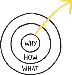
1. Remember Your ‘Why’ (beyond just making money)
At the core of it all, this fundamental principle has remained an immovable constant. If you don’t know the purpose of why you’re doing what you’re doing, how can you possibly create a clear, trustworthy User Experience for the people you want to engage with? Why did you start your business? What motivates you to get up in the morning? What part of your business brings you the most sense of satisfaction?
Your ‘why’ – whether it’s as simple as, “make ____ a little easier for people” or something truly profound like “change the way people experience _____” needs to always be at the core of what you do.
When your ‘why’ is at the core of your brand then all the distractions and extra stuff you might have thought were important starts to fade away, and the way forward is clear.
2. Define Your Goal for Achieving That ‘Why’
You need to determine exactly what you users need to do to achieve your ‘why’. Is it buying a product you’ve made? Is it signing up for a seminar? What is that one key thing you want them to do? Clear out all the things on the periphery and simply focus on that one thing. As hard as it might be to part ways with some of those other things that are important to you, in reality, and in your customers’ eyes, they do NOT matter.
As a fun exercise, I want you to take a screenshot of just the above the fold portion of your homepage. Now, count how many different actions you’re asking your users to take. How many lead to the path of that one goal you’ve defined? How many are just distractions? Can you eliminate any?
3. Find Out Who Your Users Actually Are
Once you know your ‘Why’ and you’ve narrowed down your #1 goal to achieve it, I want to ask you just one thing…
Do you actually know who the people are that you need to make your goal happen? Shockingly, most businesses don’t pay attention to this crucial part of their website’s User Experience: The User.
Who are the people you want coming to your website that are going contribute the most to helping you achieve your ‘why’? Are they male or female? Young or old? What are their interests and spending habits? What political affiliations do they have? Etc.
This is where understanding your customer personas comes into play. You need to clearly identify your top 3 ideal users and put yourself in each of their shoes when it comes to thinking about the user experience design you want to create for them. You can base this on actual customers you already have, or on the customers you want.
It’s time to nail down your ideal customer so you’ll know exactly what to say and show to them, in a way that they are most easily able to absorb the information and engage with your brand.
4. Map Out The Path Those Users to Take
Think of the last time you walked into a store, where the User Experience is in a physical space. There are certain steps from the time you step through the door, find what you’re looking for to finally purchasing. This is no different in the digital space, your user journey map will include all of the customers steps and it will consider the same general customer behaviors.
Think about your user within each one of these behavioral modes and create the path through them. Maybe it looks like this:
- Awareness – your user saw an ad for your product while on social media
- Search – your user recalls this ad and searches for your product in Google
- Consideration – your user checks out other reviews and comments about your product
- Purchase – your user is convinced and buys your product
- Retention – your user joins your mailing list to find out about other products and specials
- Advocacy – your user loves your product so much, they share their experience with it (and your brand) with their networks
5. Balance User Experience Design Ideas with Functionality
It’s way too easy to get carried away and over-design the user interface of your website while forgetting about critical functionality that can cause your users to bounce off your site at light speed. First and foremost, things need to work. Websites have been around long enough that critical actions like submitting a form, making a purchase, or even logging into an account are taken for granted.
No one ever wants to stare at that infamous spinning wheel of death, so make sure the engine-like components underneath the hood of your website are all finely tuned and functional, before fretting over tiny design elements that will end up looking plain ugly if the site doesn’t load.
6) Know When To Be Predictable
As a species, all of the simple User Experiences (UX) we’ve been exposed to have helped us develop universal behaviors that cross languages, continents and cultures. These universal behaviors could be replicated to work with almost anything we had to engage with. It’s really incredible when you think about how it translates to your website. Let me explain…
A great user experience design works because it’s predictable and instantly feel familiar. It plays on those universal behaviors that are already ingrained into everything we do, like flipping switches or turning knobs. So, when a user hits a certain spot on your pathway, what switches do they have to flip, and where are they? How will they know what do with them?
You don’t have to invent a new way of doing things just for the purpose of standing out. For example, everyone knows how to read a map. Why? Because the design and structure of a map hasn’t changed in centuries – whether sketched on paper or in Google Maps. If you try and re-invent the map, you’ll stand out for all the wrong reasons.
So, leverage what your users already know. Give them clearly designed buttons that convey “Do This” or “Do That”. Give them familiar navigation systems that they don’t need special instructions for. Give them clear signals that tell them “You’re at this spot, and you need to go here next.”
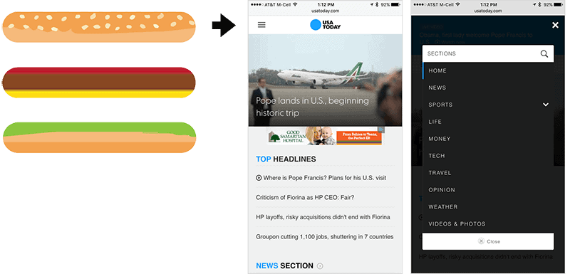
The ‘hamburger’ menu is one of the most recognizable user experience design icons on mobile devices for where the menu is located.
7) Know When To Be Creative, using the “Whizzy” Stuff
As I alluded to earlier, the more we advance technologically, the fewer limits there are to hinder our creativity. We’re now in a renaissance of interactive design where all things are possible. We have tools to create rich animations, responsive interactions and so much more that can really make the User Experience (UX) much more immersive – what I like to call the “whizzy” stuff.
Great user experiences will leverage these components in just the right places where they intuitively make sense, adding a little bit of sparkle to those knobs and switches. If done in such a manner that the user is never distracted, confused or overwhelmed these creative elements can help make the story of your brand truly stand out.
8) But… Don’t Overdo The “Whizzy” Stuff
With any great power, comes great responsibility. Yes, we all know that famous line and it holds true when it comes to the User Experience (UX) on your website when trying to be creative in an effort to stand out.
If you have enough web design years under your belt, you’ll recall the days of Flash-based sites very vividly. Ah the era of fully animated, moving audio/visual explosions of “whizzy creativity” always packaged with a “Skip Intro” button, was a prime example of things going WAY too far. But guess what, we’re heading down that path again, just this time it’s using CSS and JavaScript.
Already you’re seeing eye-straining examples of websites where the principle seems to be “if it exists, animate it!”.
In the previous point, the “whizzy” stuff adds great value to your UX, but proceed with caution, and be VERY wary to never let it hinder the main goal of your website. Remember point #2 above?
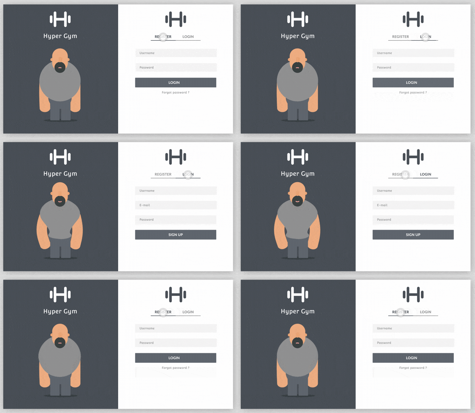
 9) Connect in Real-Time with User Feedback
On another user-driven front, there was a time when we were limited on the web when it came to giving users real-time feedback on the actions they were taking. However, as more fluid and responsive web technologies have become available, those limitations have vanished and user feedback can be delivered in real-time.
So, why not be right there with your users and speak to them when they need to trust you the most?
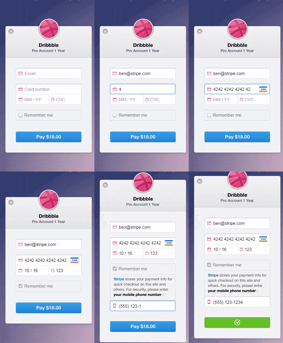
Here’s an example. When a user clicks a Pay Now button, you can have a bunch of opportunities to give them tiny bits of feedback to add that personal human touch during the second or two the payment is being processed, such as:
- Using an animated progress bar to signify payment is going through.
- Integrating timely messages attached to the process that appears softly such as “Sending Payment”, “Payment Received” and “Generating Receipt”.
- Creating a lively final screen showing the user that their payment went through. Hey, they’ve just sent you money, here’s your chance to inject some of that creative story-telling to simply say thank you.
10) Test, and Test Often
With all of these new ways to build the user experience design of your website, testing, testing and testing again is critical! Plus, it’s never been faster or easier to test thanks to all the UX analytical tools at your fingertips. You can start small with little simple experiments that can happen early in the process. Maybe test two versions of a form where the button says something different on each, or separate landing pages that function the same, but use different layouts and elements. A great tool for testing that’s used by a ton of brands large and small is VWO – https://vwo.com/
And if you can’t test on your site, there are great resources out there that dive into the tests that some of the biggest companies on the web are doing. Companies like Amazon are constantly tweaking even the smallest parts of their UX. My go-to resource is https://goodui.org that profiles hundreds of tests you can leverage.
If you test, and test often, your website has the opportunity to adapt and evolve with your users, as they (like all of us) are having to adapt to the ever-evolving landscape of User Experiences on a daily basis.
In Closing
However nostalgic we like to get as the years pass, the seemingly simpler times of flipping basic switches and turning knobs are long gone.
With the galactic smattering of good, bad, and ugly user experience design used yesterday, it has never been more important that extremely thoughtful consideration goes into ensuring your website’s UX is as clear, intuitive and trustworthy as possible.
Because really, at the end of the day, we don’t have to think about where the light switch is and which direction to flip it. Your site’s UX should be no different.
Wes Straub
User Experience Expert
KristiJane.com


 Challenge #1: Existing In An Infinitely Small Space


 9) Connect in Real-Time with User Feedback